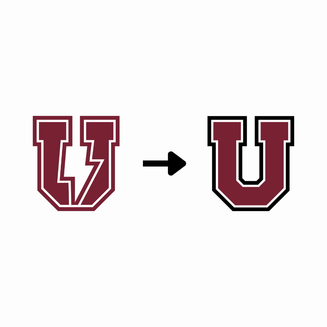
Over the past few years, Union College has undergone a lot of changes with regards to their mascot and logos. Originally, the students here on campus were called the “Dutchmen” and “Dutchwomen” before the school announced a switch over to the “Garnet Chargers” in the summer of 2023, along with an introduction to the new mascot Charger and his puppy ambassador that fall. This shift in the mascot required new developments in the college’s designs as well, and while the color of the school has remained garnet for more than one hundred and fifty years, the design created for the “U” has not been as constant. As of this school year the “U” has been altered yet again, making this two times so far in the span of two years.
The reasons for the recent change is a result of previous complaints that were made about the past “U” design, and how it is not showing the unity that the college stands for due to the lightning bolt splitting the “U” in half. The school’s hopes with this new logo are that combining the “U” while still maintaining the bolt will help to spread Union’s ideals of connection and community more clearly throughout campus.
Students and alumni have expressed mixed reactions to the recent logo change. Sophomore student and employee of the Union College Bookstore Caleb Hill stated “I think one of our main things is that we are a really old school, so I don’t understand the shift in logos,” reflecting some student confusion over the logo change as an institution. After the existing logo was retained in 1933, the change came as a surprise to many current Union students, but has been generally welcomed. The new logo is now displayed across campus and on merchandise in the campus bookstore.
As a school with a strong alumni presence, the mascot change has prompted some reactions from alumni supporters as well. Hill stated “A lot of alumni come in and complain quite a bit…they gravitate towards articles of clothing that have the original block U”. What might the change of the union “U” bring to our campus store? There may be future complications, with reluctance to purchase items containing the new logo.
After speaking with staff members on campus, the constant new versions of the “U” have indeed affected the college so far in regards to its economic standing, and not in a beneficial way. “The original change to the bolt U had a negative impact that we haven’t fully measured because we have another new logo.” said one staff member, “So I would say there was a negative downturn, but hopefully that turns around with this new logo.”
As the trimester goes on, the new and unified bolt “U” will continue to replace the old ones. Most, if not all, have been altered already, so if you have not yet seen one make sure to keep an eye out for this changed “U” around campus.